Over the years, we’ve been asked for tips on how we create presentations. A key thing that we always try to remember is to use the same principles that we talk about with the Message Box (knowing your audience, crafting your messages with them in mind, limiting your key points to 3-5 things, sharing the ‘So What?’), but to apply them visually, as well as with your remarks. Ultimately you want the visual images and information that you’re sharing to complement what you’re saying, not distract from or overshadow it, so our top rule of thumb with presentations is that less is more.
There are lots of great resources out there already about how to build a better presentation – here are some of our favorites:
Todd Reubold at the Center for the Environment at the University of Minnesota has a nice video breaking down presentation do’s & don’ts (link to Todd’s slides)
If you’d like a brief list of 10 key things to keep in mind, this one from Garr Reynolds covers the basics.
Edward Tufte is a very influential designer, particularly for data visualization. If you’d like more detail on visualizing data, this set of slides shares key principles from Edward Tufte, compiled by Mika Aldaba.
Duarte Design is a well-known communications organization. Nancy Duarte, one of the founders, has a book that provides lots of design insight.
It’s also important to think about how you can make your presentations accessible for everyone in your audience. This article raises a number of science-specific points about accessibility and shares lots of information:
In addition to these helpful resources, here are some additional tips that we apply for our presentations at COMPASS.
Consistency. We make sure to be consistent in our use of background, font, font size, and colors both within individual slides and across the whole presentation. Some considerations as you’re making decisions about these aspects of your presentation:
 Presenting. A key thing for us is knowing your stuff, and practicing in advance, but we also really appreciate some tech features and prep that make presenting more pleasant for us and hopefully more enjoyable for the people we’re talking to.
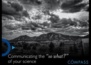
- Black backgrounds for presentations are easier to look at in a wider variety of room/projector situations (some rooms are bright, some are dark, and you can’t always do anything about it – and the same applies to projectors).
- Not all colors or fonts are equally easy to read for everyone, so we try to take that into consideration as we make our slides, and also make sure that important information isn’t conveyed by color alone.
- Images are large and high-definition.
- Best practices for images: we use Creative Commons images and provide attribution, or use images we’ve taken whenever possible. Flickr is a good place to look for high-def Creative Commons images (use the Advanced Search filters); also see Death to Stock Photo.
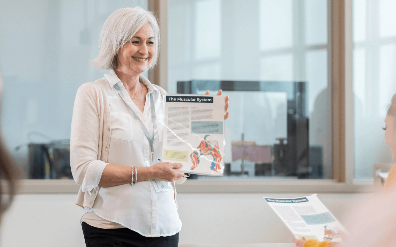
- We tailor some of our slides to the group we’re speaking to – so if, for example, we’re talking to a group in Colorado, when appropriate we’ll use images of Colorado landmarks that they’re likely to be familiar with, rather than generic images.
Presenting. A key thing for us is knowing your stuff, and practicing in advance, but we also really appreciate some tech features and prep that make presenting more pleasant for us and hopefully more enjoyable for the people we’re talking to.
- This is mentioned in many resources, but it bears repeating: make sure the audience can see your face as you are speaking to them, both because it’s more interesting for them than you facing the projector or being buried in your notes, but also because it can help people to understand what you’re saying better, particularly if they need to lip-read.
- Presenter notes are helpful to include in presentations, because they travel with the presentation – so if we want to revisit a presentation months or years after we first delivered it, it’s much easier to find the notes that go with each slide. It can also be a good reminder to limit words on the slide – if we have a lot to say about a slide, we put those points into the presenter notes, not on the slide itself! Generally, the number of words on the slide should be less than the number of words in the presenter notes.
- Presenter view. Our team uses Keynote, where presenter view allows us to see both the presenter notes and the slide we are on, as well as the slide that’s coming next (and a timer so that we can stay on track). Powerpoint also has this functionality. If you haven’t tried it, give it a go!
- Troubleshooting in advance can provide extra confidence. We’ll often have back-up copies of our presentations on flashdrive in both Keynote, PPT, and PDF. As a last resort if both Keynote and Powerpoint fail, you can flip through PDF pages for a similar effect.